A cherry dining table can anchor a Bay Area home for decades, but the wrong wall color can make that same table look orange, pink, or strangely heavy. The problem usually isn't taste. It's timing, light, and a wood that keeps changing after the paint dries. Homeowners asking what colors go with cherry wood need a plan built around the actual piece in the actual room, not a generic list copied from a showroom photo.
The Cherry Wood Color Problem Most Homeowners Miss
A homeowner stands in a South San Francisco living room with a cherry media console against one wall and a fan of paint chips in hand. At noon, a soft beige looks calm. By evening, under warm lamps, that beige turns pink and the console looks redder than it did in daylight. Nothing changed except the light, yet the room suddenly feels wrong.
That scene repeats because cherry wood isn't a fixed color. It's a warm, red-brown material that deepens as it ages, so a palette chosen for a freshly finished piece may not suit the richer tone it develops. A peer-reviewed study measuring wood in the CIE Lab* color system found that ultraviolet exposure and subsequent aging increased redness more than yellowness in American cherry.
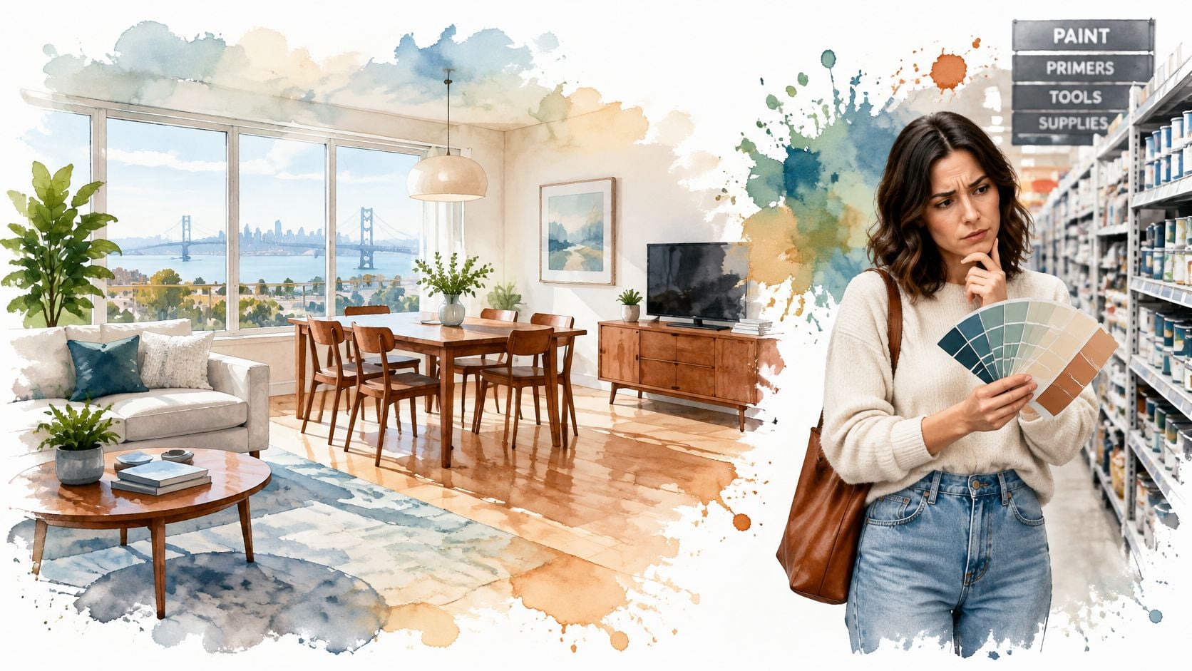
Why the Paint Aisle Freezes Good Decision Makers
Paint chips promise certainty, but they remove every variable that matters. Flooring, upholstery, bulb temperature, and the direction of daylight all shift how cherry reads. Resources from Cherrywood decorators can help homeowners think through preparation and finish, yet the color decision still has to happen beside the furniture itself.
Practical rule: Don't judge a color against a memory of cherry. Judge it against the piece, in the room, at two different times of day.
Homeowners comparing species and finishes can review Amish oak, cherry, and hickory furniture options to see how grain and stain change the starting tone. That comparison matters because solid cherry, stained cherry, and veneer don't age identically. A light natural finish and a dark traditional stain may share a name, but they demand different wall values and different levels of contrast.
Quality cherry case goods are investment pieces, often kept through several moves and style changes. Getting the surrounding palette right protects that investment and prevents a costly cycle of repainting, replacing rugs, and second guessing upholstery. Treat the decision as a room and lighting decision first, and the right colors become far easier to spot.
Why Cherry Wood Responds to Certain Color Families
Cherry starts with a red-brown undertone, and that undertone does most of the work in any palette. Colors that sit near red on the color wheel amplify it. Colors opposite red calm it down. Once a homeowner understands that single relationship, a paint chip stops being a guess and becomes a prediction.
Blue-green complements work because they counterbalance cherry's red component without fighting its depth. Muted sage, eucalyptus, teal, and blue-gray give the eye a cooler counterpoint, so the wood looks rich instead of overheated. The effect is strongest when those colors stay muted. A grayed sage soothes cherry. A bright turquoise competes with it.
Value Contrast Matters as Much as Hue
Hue is only half the decision. Value, meaning how light or dark a color is, decides whether furniture reads clearly against a wall. Pale walls create strong separation from medium to dark cherry, so a dresser or bookcase holds its silhouette. Dark walls in charcoal or navy compress that separation, and a substantial piece can disappear into its background in a dim room.
Warm neutrals solve a different problem. Ivory, oatmeal, mushroom, and greige provide a low chroma field that lets cherry stay visually dominant. They don't cool the wood down, and they don't push it warmer. That restraint is why consultants reach for them when a room contains several cherry pieces and needs calm more than contrast. Reviewing wood finishes and colors for custom furniture helps homeowners see how finish depth changes the amount of contrast a wall should supply.
- Colors that complement: blue-greens and blue-grays that offset red without matching it.
- Colors that support: warm neutrals that stay quiet and let grain and form lead.
- Colors that compete: saturated red, orange, and burgundy that reinforce the same hue family.
A color doesn't need to match cherry to belong with it. It needs to give cherry something balanced to sit against.
Saturated warm upholstery deserves special caution. A burgundy sofa beside a cherry sideboard can look coordinated in a catalog, then produce excessive warmth as the finish darkens. The safer test is simple. If a fabric makes the wood look more orange at arm's length, the palette is already leaning too warm.
The Core Palette Categories That Work With Cherry
Four palette categories cover nearly every successful cherry room. Homeowners don't need all four at full strength. The strongest rooms usually choose one category for walls, a second for textiles, and a restrained third for accents and metal finishes.
Cherry Wood Palette Categories at a Glance
| Category | Example Shades | Effect on the Room |
|---|---|---|
| Warm neutrals | Ivory, oatmeal, greige, mushroom | Brightens the room and lets cherry lead |
| Blue-green complements | Sage, eucalyptus, teal, blue-gray | Balances redness and adds calm contrast |
| Restrained warm accents | Terracotta, rust, soft amber | Adds warmth in small, controlled doses |
| Metallics and finishes | Brushed brass, antique bronze, matte black | Bridges wood tones and sharpens edges |
Warm neutrals are the most forgiving starting point for Furniture South San Francisco shoppers who want a room that won't date quickly. Ivory walls make a cherry bed frame feel warm rather than heavy. Greige upholstery bridges cherry and cooler flooring. Mushroom adds depth without the pink risk that some beiges carry under warm bulbs. The mistake is choosing a neutral that's too yellow, which can push cherry toward orange.
Blue-green complements deliver the clearest visual relief. Sage on an accent wall cools a dining room without making it feel cold. Eucalyptus in a rug pattern softens a living room full of case goods. Blue-gray upholstery gives a cherry side table a crisp partner. Homeowners who want broader scheme ideas can compare approaches in a North Shore interior colour scheme guide, then narrow choices against the actual wood at home.
Warm accents need discipline. Terracotta in a single cushion or a piece of pottery can echo cherry's warmth, but terracotta walls plus rust upholstery plus cherry furniture usually overwhelm a room. Keep these shades small, textured, and removable.
Metallics finish the composition. Brushed brass warms without adding another large color field. Antique bronze suits traditional cherry and hides visual clutter. Matte black gives contemporary rooms a clean edge and prevents warm wood from feeling old fashioned. A Design Consultation can test these directions against real finishes, and an expert guide to building the perfect color palette offers a useful framework before that visit.
Consultant's shortcut: Pick the wall from neutrals or blue-greens first. Add warm accents last, and only after the room already feels balanced.
How to Test Colors Against Your Actual Furniture
Testing beats opinion. A color that looks perfect beside cherry in a bright showroom can look pink, brown, or dull at home because of metamerism, the tendency for colors to shift under different light sources. Homeowners can avoid most mistakes with large samples, two lighting checks, and a simple contrast measurement.
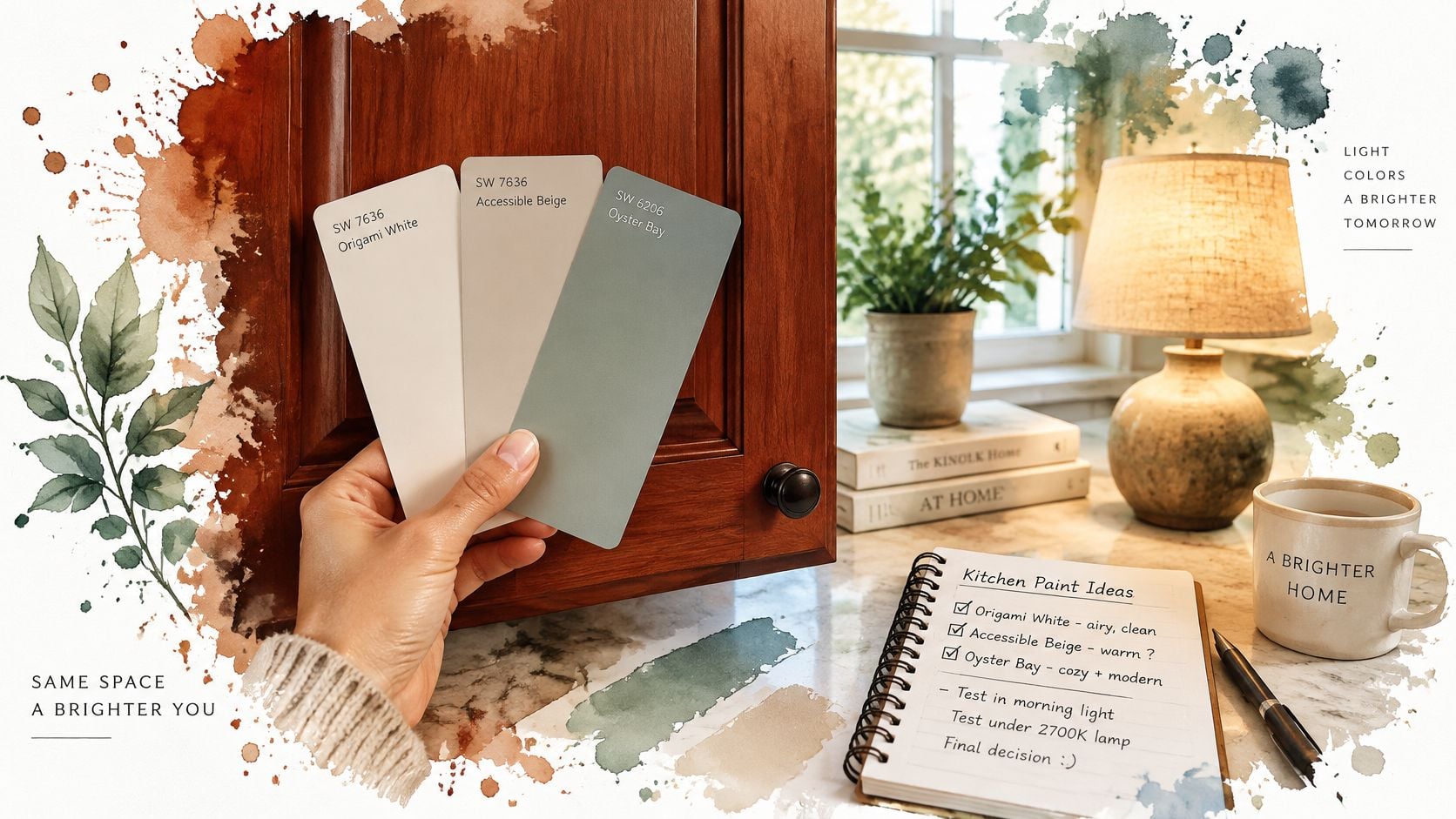
Start with three large samples, not one favorite chip. Tape or paint them directly beside the furniture, not on an empty wall across the room. Include one lighter option than expected, because colors often read darker once they cover four walls next to medium tone wood.
- Check natural daylight: View samples midmorning and midafternoon with lamps off.
- Check evening light: View the same samples under 2700 to 3000 K bulbs, the warm range used in most living spaces.
- Check adjacent materials: Hold flooring, rug, and upholstery samples in the same sight line.
Use LRV to Keep Furniture From Disappearing
Light Reflectance Value, or LRV, runs from 0 to 99 and describes how much light a surface reflects. Guidance derived from BS 8300-2:2018 and BS 8493 identifies a difference of more than 30 LRV points as strong visual contrast, a threshold explained in the LRV guidance booklet with colour sheets. Homeowners don't need laboratory precision. Manufacturer LRV data is enough to confirm whether a wall will separate from cherry or merge with it.
Pale warm white, soft ivory, and light greige usually create substantial separation from cherry, which helps smaller Bay Area rooms feel brighter. Mid value sage, slate blue, and taupe create a more integrated look, but a darker stain can reduce perceived contrast. A guide to picking the perfect paint color for a home can support the sampling process, yet the final verdict should come from samples left in place for at least two full days.
If a sample only works at noon, it doesn't work. The right color holds up after sunset too.
Lighting Direction Changes Which Colors Actually Work
The bulb often matters more than the paint brand. Two identical greige walls can behave completely differently in a north facing bedroom and a west facing dining room. Homeowners who ignore exposure end up blaming the color when the light caused the failure.
Incandescent and halogen sources intensify reds and yellows, while daylight can make cool colors appear more vivid, a relationship detailed in guidance on how light affects paint and color. That same guidance notes that bright wall surfaces can make a room appear wider, while a bright rear wall can make it seem deeper. For cherry furniture, those effects aren't academic. They decide whether a room feels balanced or crowded.
Match the Palette to the Exposure
- North facing and low light rooms: Choose warm off-whites or balanced greiges. Cool blue-grays can turn chilly here, and cherry may look muddy instead of rich.
- South facing rooms with strong daylight: Muted sage, eucalyptus, and blue-gray hold up well because ample light keeps them from feeling cold.
- West facing rooms: Use saturated terracotta, rust, and warm reds cautiously. Late afternoon light intensifies them and can make cherry feel overwhelming.
- East facing rooms: Test carefully in the morning and evening, since the light shifts from bright and warm to noticeably cooler and dimmer.
Bulb temperature deserves the same attention. Warm evening lighting around 2700 K amplifies cherry's red cast. Lighting closer to 3000 K keeps wall colors truer while still feeling residential. Homeowners should change questionable bulbs before repainting, because a cheap bulb swap sometimes solves what looked like a paint problem. Practical ideas in guidance for putting a living room in the best light can help structure that check.
Change the bulb before changing the wall. A palette judged under the wrong light isn't being judged fairly.
The contrarian point matters most. Cool versus warm isn't an absolute rule. A cooler wall may balance cherry under warm lamps, whereas a warm beige in the same room may amplify the red cast. In Bay Area Interior Design, fog softened daylight and bright inland sun can occur in homes only a few miles apart. Exposure specific testing isn't extra work. It's the work.
Room-by-Room Strategies for Living, Dining, and Bedroom Spaces
A palette category becomes useful only when it turns into a room recipe. Living rooms need flexibility, dining rooms need presence under evening light, and bedrooms need quiet. The same cherry finish can succeed in all three with different supporting colors.
Living Rooms Need a Calm Anchor
Start with a warm neutral wall in ivory, oatmeal, or light greige. That backdrop lets a cherry console, bookcase, or coffee table read clearly without turning the room into a wood showcase. Add one blue-green textile, such as a sage accent chair or eucalyptus patterned rug, to cool the composition. Brushed brass or antique bronze lamps and hardware can bridge cherry with other finishes already in the room.
Homeowners building a full living room scheme may find additional room specific thinking in an interior paint color guide for CT homes, although Bay Area light still requires local sampling. For Custom Furniture, upholstery should stay lower in saturation than the wood. A muted fabric keeps the cherry piece as the focal point instead of creating two competing stars.
Dining Rooms Can Carry More Saturation
A cherry dining table sits under focused evening light, so walls can go slightly deeper. Muted olive creates complementary contrast and feels grounded during dinner. Warm greige offers a softer transitional option that works with both traditional and simplified chairs. Blue-gray is the cooler alternate for rooms with good daylight.
Keep the table setting quiet. Ivory linens, natural fiber rugs, and simple centerpieces prevent pattern and color from competing with the table's grain. If chairs are upholstered, oatmeal or soft taupe usually outperforms rust or burgundy because the table already supplies the warmth.
Bedrooms Should Use the Softest End of the Palette
Bedrooms benefit from restraint. Oat, ivory, and dusty sage let cherry case goods feel warm and substantial without energizing the room at night. A cherry dresser against ivory walls becomes a clear focal point. Dusty sage bedding adds the complementary cool note in a layer that's easy to change later.
- Primary living room recipe: ivory walls, sage textile, brushed brass accents.
- Primary dining recipe: muted olive or warm greige walls, ivory linens, natural fiber rug.
- Primary bedroom recipe: oat walls, dusty sage bedding, quiet cream textiles.
Across all three rooms, the pattern stays consistent. Cherry supplies warmth and visual weight. Walls and textiles supply either calm neutrality or measured cool contrast. Rooms fail when every surface tries to be warm, dark, and decorative at once.
Choosing Colors That Outlast a Single Design Cycle
A cherry dining set should not be sent to the curb because paint fashion moved on. Choose colors for the piece it will become: redder, deeper, and more polished with age. Neutral walls, restrained blue-greens, and adaptable textiles give that finish room to deepen, while paint and fabric carry the updates.
The environmental math favors restraint. A 2025 life-cycle assessment of 25 household and office furniture pieces found that pre-production accounted for 42.25% to 99.98% of total environmental impact, with an average contribution of 76%, according to the life-cycle assessment of household and office furniture. Keeping furniture in service longer spreads that initial burden across more years instead of repeating it with every replacement.
Federal guidance points the same direction. The U.S. Environmental Protection Agency guidance on thinking green while shopping recommends maintaining and repairing furniture so it is discarded and replaced less often, and notes that more durable products are less likely to need replacement. For a homeowner, repainting a room is a smaller bill than replacing a solid cherry bedroom suite.
Build Flexibility Into the First Decision
Research on circular furniture use identifies repair, reuse, refurbishment, and remanufacturing as value retention processes, with reuse producing the lowest impact among the evaluated scenarios in the study of wood furniture value retention processes. A cherry table can be refinished, shifted to another room, or paired with new chairs. Flexible wall colors raise the odds it keeps earning its place after tastes change.
Trend pressure still exists. Survey data summarized in a National Wood Flooring Association outlook published by Hardwood Floors Magazine indicated that nearly 66% of members expected increased demand for cleaner, more natural wood colors in 2025. Read that correctly: the market wants lighter surroundings around wood, quieter textiles, and less visual heaviness.
My recommendation is conservative where the money is and loose where it is cheap. Keep walls in ivory, warm greige, muted olive, dusty sage, or blue-gray, then put fashion into lamps, pillows, art, and a rug that can leave in five years. If a color only flatters fresh light cherry, skip it. Pick the version that still looks calm when the wood turns deeper in north light or richer under warm evening bulbs.
Heritage and customization earn their keep at Giorgi Bros. Furniture, a family-owned showroom in South San Francisco since 1933, with custom order services for fabrics, leathers, wood species, and finishes, supported by non-commission sales staff working as consultants rather than pushing a floor model. Homeowners can explore 50,000 square feet of inspiration, compare Amish furniture and other investment pieces in person, and discuss available financing options without pressure. The same long view runs from dining furniture to premium mattresses chosen for durable comfort.
Your Next Step Toward a Room That Works
Testing settles this faster than reading about it. Pull three large samples in two palette directions, one warm neutral and one blue-green, and prop each directly against the cherry piece. Leave them up for a few days. Colors that look right at the paint counter often flatten once they sit next to real grain.
Then run the contrast check. Note the approximate LRV from the paint manufacturer and confirm the wall either separates clearly from the furniture or sits close in value on purpose. Accidental low contrast makes rooms feel muddy. Deliberate low contrast reads calm and integrated, provided the lighting is strong enough to hold the furniture's outline.
- View samples upright: Wall color reads differently on a vertical surface than on a flat chip.
- Judge under both lights: Check daylight and evening bulbs, since cherry's red undertone shifts with color temperature.
- Include the floor and one textile: Cherry flooring or a warm rug pulls a room's palette warmer than a swatch suggests.
- Give it a week: A color that still looks right after repeated viewing is the one worth buying.
For a second set of eyes, the showroom keeps actual cherry case goods, custom upholstery, and finish samples available to test against. A consultant can coordinate a new finish with pieces already in the home and compare fabrics under showroom and home lighting. An hour of comparing real finishes beats a week of guessing from chips.
The best palette is the one that still makes sense after the cherry deepens and the room changes around it.
Bring photos of the room, a finish sample, and the colors under consideration to Giorgi Bros. Furniture, where non-commission Design Consultants can test cherry finishes, custom fabrics, and leathers against real pieces in the South San Francisco showroom. Book a Design Consultation for no-pressure guidance on a palette that will still work as the wood deepens, and invest once in furniture and colors built to stay in service for life.