
A homeowner stands at a showroom counter with two wood samples in hand. One seems to match the dining chairs, while the other looks better beside the floor. Both are attractive. Neither looks exactly the same under daylight, evening lamps, or the sheen of the finished piece.
That moment is why wood finishes colors deserve more attention than a quick swatch choice. The right finish has to suit the room, the species, the light, and the way the furniture will age. A beautiful color on delivery day can become the wrong choice if it clashes with surrounding pieces or changes noticeably near a bright window.
At Giorgi Bros. Furniture, a family-owned South San Francisco showroom serving the Bay Area for over 90 years, non-commission Consultants help shoppers work through those trade-offs without pressure. The practical standard is simple: choose an investment piece that still makes sense years from now, not merely one that photographs well today.
When a Wood Finish Becomes a Real Decision
The shopper at the counter usually starts with a color name. “Warm walnut” sounds clear enough until the sample sits beside a honey-toned floor, a cooler gray wall, or an older dining chair with a darker topcoat. Then the name stops helping. The actual wood, grain, lighting, and sheen take over.
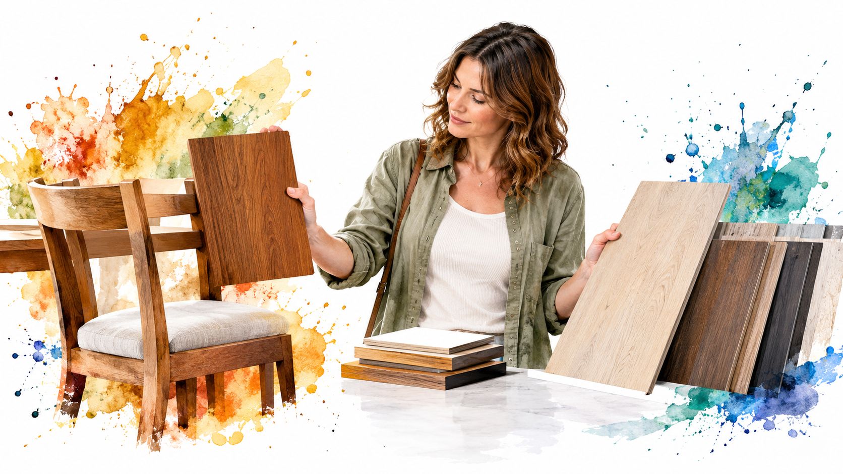
A finish changes more than the color of a tabletop. It affects how much grain remains visible, whether a room feels relaxed or formal, and how easily a new piece coordinates with existing furniture. That makes finish selection part of the larger question of how to buy quality furniture, especially when the piece is intended to remain in the home for decades.
Start with the room, not the catalog
The strongest starting point is the room where the furniture will live. Look at the floor, nearby case goods, upholstery, wall color, and the direction of natural light. A finish that feels rich and balanced in a softly lit dining room may appear heavy in a small bedroom or overly orange beside a sunlit floor.
Three questions should guide the decision:
- Which finish family fits the room? Transparent stains, dyes, and painted finishes create very different relationships with the grain.
- How will the wood species alter the result? The same formula can look restrained on one species and dramatically contrasted on another.
- How will the color change over time? Sunlight, coating chemistry, and the natural aging of wood can shift the appearance.
A physical sample remains more trustworthy than a screen. Hold it vertically and horizontally, view it in daylight and evening light, and compare it with the pieces it must live beside. The finish should make sense in the full room, not only in the hand.
Practical rule: If a finish only looks right under one light source, it isn't ready for approval.
That rule matters for custom furniture because the choice is rarely isolated. A dining table may need to coordinate with chairs, flooring, and future additions. A bedroom suite may sit near a window for years. A well-made piece deserves a finish selected with the same care given to its construction.
Understanding Stains, Dyes, and Paints
A buyer can't judge color accurately without knowing what the finish does to the wood. Stains, dyes, and paints are not three shades of the same idea. They create three different levels of transparency, grain visibility, and visual depth.
Stains keep the wood involved
A penetrating stain carries color into the surface and usually leaves the underlying grain visible. Open-grained species can show strong contrast because pigment collects in pores and texture. On a familiar oak surface, a brown stain may emphasize the grain pattern, while the same color on a tighter-grained species can appear smoother and more uniform.
Stains suit buyers who want the piece to remain visibly wooden. Light oak, honey, natural, walnut, chestnut, and espresso all belong to a broad brown spectrum, but they don't communicate the same mood. Lighter tones feel casual and airy. Walnut and chestnut can bring warmth and formality. Espresso creates more visual weight.
A consumer-preference survey on furniture staining found that brown and brown-related tones were selected by 51.4% of respondents, while red and related tones ranked second at 23.0%, and blue and related tones accounted for 19.8% (consumer-preference survey on furniture staining). That result isn't a universal global sales share, but it supports a practical showroom observation: buyers often want several kinds of brown, not one generic brown.
Dyes bring stronger color into the surface
Dyes dissolve into the finishing system and can produce clearer, deeper chromatic color than a typical pigment stain. They can work well when a buyer wants the wood to retain visual depth while moving beyond traditional brown. The result still depends heavily on species, absorption, preparation, and topcoat.
Dyes are less forgiving of inconsistent preparation. A sample must be made on the actual wood because a small difference in absorption can change the apparent saturation. The finish name alone won't predict the result.
Paints and pigmented finishes cover the substrate
Paint and heavily pigmented finishes hide most of the natural wood color and reduce the effect of grain. That can be the right answer when the room calls for a clean, architectural surface or when the natural substrate doesn't support the desired color.
The trade-off is straightforward. Paint offers stronger control over the visible color, but it gives up much of the species identity. A transparent stain preserves the wood story, while paint makes the chosen color the dominant feature.
For a broader explanation of how finish systems affect appearance, the Jennifer Gilmer Kitchen & Bath design guide offers useful background on finish choices and surface character. For furniture-specific considerations, the guide to best wood finishes for furniture helps place color selection alongside protection and use.
How Wood Species Shape the Final Color
The species is part of the finish specification. A stain doesn't arrive at the surface as a neutral color. It interacts with pores, density, grain structure, extractives, and the wood's starting tone.
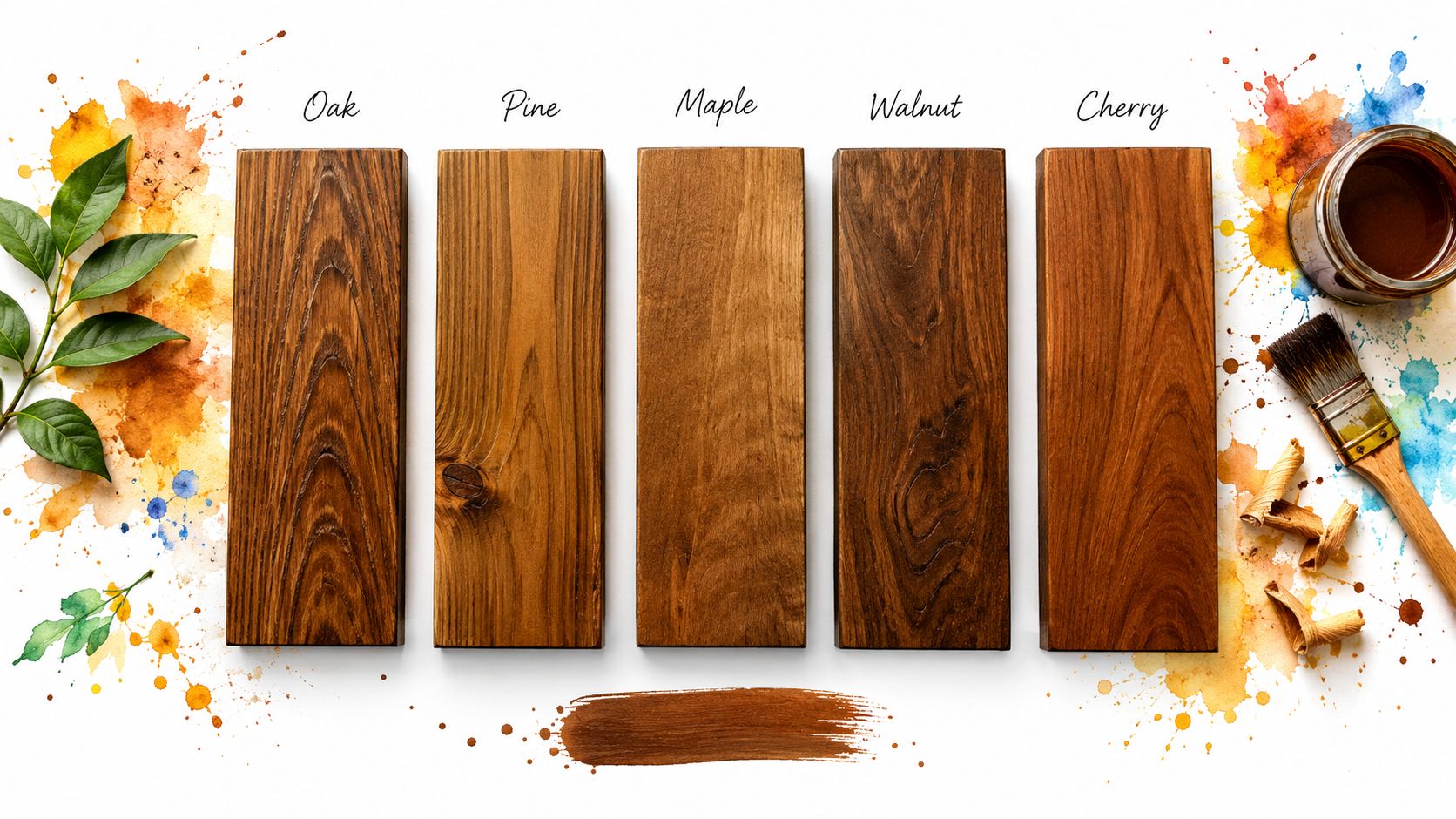
Oak amplifies contrast
Oak's open grain can make a transparent stain look more graphic and pronounced. A medium brown may read as rustic and textured rather than smooth and quiet. That effect appeals to buyers who want the grain to announce itself, but it can disappoint someone expecting an even, understated surface.
Maple rewards restraint
Maple has a relatively fine, even visual texture. A dark stain can sometimes look less natural because it suppresses the subtle character that makes maple distinctive. A clear or lightly tinted finish often preserves its clean appearance, while a carefully tested dye can deliver color without making the surface look muddy.
Walnut starts with depth
Walnut brings its own rich foundation, so it often needs less color correction than paler species. A transparent finish can preserve its natural variation, while a darker formula may remove useful distinction between the wood and the stain. The right choice usually protects the species' identity rather than covering it.
Cherry changes the conversation over time
Cherry begins with warmth and can develop a deeper, more mature appearance as it ages. That makes it a strong choice for buyers who appreciate patina, but the initial sample shouldn't be treated as a permanent prediction. A transparent finish and realistic expectations matter more than chasing a perfectly fixed color.
Ash keeps the grain visible
Ash can show a pronounced grain pattern while maintaining a lighter overall character. It works well for buyers who want visible texture without the heavier visual weight of a deep stain. The exact outcome still depends on preparation and topcoat sheen.
The U.S. Forest Service reports that redwood and western redcedar are among the easiest softwoods to finish, while southern yellow pine and Douglas-fir are more difficult, a difference associated with density and latewood band width (U.S. Forest Service wood-finishing guidance). The lesson applies broadly: porosity and structure influence how consistently color develops.
A finish color isn't selected independently of the wood. The species is the first color decision.
Buyers considering Amish oak and cherry hickory furniture should compare samples on the intended species, not rely on a finish name shown on another wood. A consultant can help identify whether the desired look comes from the stain, the species, or the relationship between both.
Why Trending Natural Finishes Are Not Always the Safest Pick
Natural wood tones are having a strong moment. A 2025 National Wood Flooring Association member outlook reported that 66% of respondents expected demand for natural wood finishes to rise, while dark colors, gray stains, and heavy character were being avoided (2025 industry outlook). That direction makes sense. Natural finishes show grain, feel less decorated, and let the species contribute to the design.
Natural doesn't mean maintenance-free or color-stable. Light finishes can reveal changes that a darker, more heavily pigmented surface disguises. Wood may become warmer, darker, or more varied near windows. Clear coatings can also change appearance as they age.
Sun exposure changes the recommendation
A high-sun living room needs a different finish conversation from a low-light bedroom. West-facing windows can place strong demands on a tabletop or sideboard. Furniture near glass should be evaluated for likely color drift, not only initial appeal.
Accelerated-aging research shows that ultraviolet and visible radiation can affect both wood and coating polymers, producing yellowing or browning, shifts in lightness and hue, reduced gloss, and eventual surface checking. Organic ultraviolet absorbers may offer stronger short-term protection, while inorganic additives can perform better over longer intervals in some tested systems; reported checkpoints showed yellowing reductions of 41% to 65% (wood-coating accelerated-aging study).
That doesn't make a light finish a poor choice. It means the finish system, room placement, and shading strategy belong in the same decision.
Stress-test the fashionable choice
Before approving a natural oak, pale wash, or lightly tinted finish, check:
- Direct sunlight: Identify whether the piece will sit near bright windows.
- Species response: Test the finish on the actual wood, especially when the natural color is already warm.
- Surface use: Consider whether the top will receive frequent contact, spills, or movement.
- Aging preference: Decide whether gradual patina feels desirable or distracting.
- Room coordination: Compare the sample with flooring and nearby pieces under more than one light source.
Low-emission construction and finish choices can also matter to buyers furnishing the whole home. The discussion of low-VOC furniture provides a useful starting point for considering finish chemistry alongside indoor comfort and long-term use.
The safest finish isn't automatically the trendiest one. It is the one whose aging pattern suits the household.
Matching Finish Colors to Décor and Room Conditions
Finish color belongs to the room's entire visual system. Flooring, upholstery, wall color, metal accents, and light all influence whether a wood tone feels balanced. A sample can appear cooler beside warm textiles and warmer beside pale walls.
Sheen changes the reading, too. A glossier surface reflects more light and can make color appear brighter or more saturated. A matte surface absorbs more visual attention and often feels quieter. Satin sits between those effects, but the intended topcoat should always be included in the sample comparison.
A practical comparison
| Finish Family | Best Room Conditions | Maintenance Profile | Coordination Strength |
|---|---|---|---|
| Transparent stain | Dining rooms and living spaces where grain should remain visible | Shows species variation and may reveal surface changes | Strong with existing wood when undertones are matched |
| Dye-based finish | Rooms calling for clearer or deeper color while retaining wood character | Requires careful sampling and consistent preparation | Useful when a custom tone needs more chromatic depth |
| Painted or heavily pigmented finish | Low-light rooms or designs needing a controlled, opaque color | Conceals much of the natural substrate but still needs proper care | Strong when matching painted cabinetry, walls, or architectural elements |
Match the tone before matching the shade
A warm floor doesn't require an identical table finish. It needs a compatible undertone. Two different brown finishes can work together when one is lighter or darker but both share a related warmth. Exact matching becomes more difficult when the species, sheen, or age differs.
For oak rooms, a useful resource on modern oak color palette ideas can help organize wall, textile, and accent choices around the wood's natural warmth. The final decision should still come from physical samples in the actual room.
Use the light as part of the sample
A sample should be viewed:
- Near the room's brightest window.
- In the room's central light.
- Under evening lighting.
- Beside the existing furniture it must coordinate with.
A bedroom with limited daylight may welcome a lighter finish that keeps the room open. A formal dining room can carry a deeper tone because the furniture provides a focal point. A busy family surface may benefit from a finish whose variation is forgiving rather than one that highlights every shift.
The right question isn't “Which color is most popular?” It is “Which color will look settled in this room under its actual light?”
That question protects buyers from making a finish decision in a showroom vacuum. The Bay Area's changing daylight makes this comparison especially important for custom furniture placed near windows.
Specifying Custom Finishes with Confidence
“Medium walnut” is a useful conversation starter, but it isn't a complete production specification. Color names vary between manufacturers, species, applications, and topcoats. A custom order needs a physical reference and a clear tolerance.
Approve the sample on the actual species
The sample should use the wood selected for the furniture. A stain applied to oak won't predict the same result on maple or walnut because absorption and grain structure differ. The sample should also include the intended sheen. Stain alone isn't enough if the final piece will receive a satin or matte clearcoat.
The most reliable process includes:
- Physical approval: Compare a finished sample rather than a digital image.
- Species accuracy: Use the same wood species and, where practical, a comparable grain structure.
- Lighting consistency: Review the sample under a consistent daylight-equivalent light and in the intended room.
- Written reference: Keep the approved sample and finish details with the order record.
- Future matching: Preserve enough information to support a later chair, case piece, or replacement component.
Use measurable color targets
The CIE Lab* system separates lightness, red-green balance, and yellow-blue balance. A total color difference, expressed as ΔE, turns changes between samples into a single comparison. One wood-coating comparison identifies ΔE greater than 3 as generally visible to the unaided eye and ΔE of 12 or more as a distinctly different color (wood-coating color comparison).
That doesn't mean every household needs laboratory equipment. It does mean finish names shouldn't carry the entire burden of accuracy. A documented target reduces confusion when a buyer orders additional pieces later.
Plan for the finish's future
Wood-finish color is time-dependent. Aging, ultraviolet exposure, coating chemistry, and room conditions can change the result. Comparative research found that shellac-coated maple and walnut produced different color-difference values, ΔE 31.06 for maple and ΔE 13.00 for walnut, while shellac reduced color change after 72 hours of ultraviolet exposure by 83% for maple and 59% for walnut compared with uncoated controls (comparative wood-finish conservation study).
For a custom order, that supports a direct conversation about window exposure, shading, maintenance, and future coordination. The custom wood finishes process should begin with those practical conditions, not just a color label.
A Finish Color You Will Still Love in Ten Years
A finish chosen for light, species, sheen, and maintenance is more likely to remain useful than one chosen as a quick décor update. That matters because quality furniture should stay in service. A piece that can be cared for, repaired, and matched later becomes an investment piece rather than a temporary replacement.
A 2023 peer-reviewed study of three wood-based chair case studies concluded that circular-design measures, including modular construction and design for disassembly, can extend product life and reduce selected environmental impacts (peer-reviewed circular furniture study). Finish selection fits that same buy-it-for-life logic. A finish that suits the home and ages acceptably can help the furniture remain wanted and useful.
Giorgi Bros. Furniture offers custom order services covering wood species, stains, sheens, fabrics, and leathers, along with a 50,000-square-foot South San Francisco Showroom where buyers can compare materials in person. Non-Commission Sales Staff and Design Experts provide no-pressure guidance, so the decision can account for room light, existing furniture, and long-term goals. Flexible financing options are available for qualified purchases, and the team also supports broader Bay Area Interior Design needs.
For a family-owned business serving the region since 1933, the point isn't to rush a color decision. It is to help the buyer select Custom Furniture that still feels right after the room, the light, and the finish have had time to settle.
Visit Giorgi Bros. Furniture in South San Francisco to compare wood species and finished samples in person, or book a Design Consultation for help coordinating a custom finish with existing furniture. The team can also discuss Amish Furniture, custom order options, Premium Mattresses, and white-glove delivery as part of a longer-term furnishing plan.