A lot of Bay Area homeowners are standing in the same spot right now. They're looking from the sofa toward the kitchen, or from the island back toward the living area, and something feels unsettled. The room is open, but it doesn't flow. One side works harder than the other. The furniture fits the walls, not the way the household lives.
That's where good planning changes everything. To design living room and kitchen spaces well, the goal isn't to make both sides match. It's to make them work together. In real homes, especially homes with awkward corners, offset openings, or limited square footage, the most successful layouts are often asymmetric. They give more room to the activities that need it, then use furniture, materials, and lighting to make the whole space feel connected.
Before You Move a Thing Planning Your Combined Space
A Bay Area family opens up the wall between the kitchen and living room, brings in a larger sofa, adds stools at the island, and still ends up with a room that feels off. The problem usually starts before any furniture arrives. The plan was built around pieces they liked, not around the shape and demands of the room.
In combined spaces, planning starts with architecture and daily use. Awkward angles, offset windows, short return walls, and narrow pass-throughs have more influence on the final layout than any finish choice. After decades of working in real local homes, we have seen the same pattern again and again. Rooms work better when each zone is sized for what happens there, even if the layout is intentionally uneven.
Start with use, then size each zone accordingly
A combined room has to do more than look coordinated. It has to support cooking, conversation, homework, television, hosting, storage, and movement, often in the same footprint. Those needs rarely divide into equal halves.
That is why the first planning question is not what style to buy. It is how much room each activity deserves.
- Daily rhythm: Who uses the room at the same time, and for what?
- Kitchen edge activity: Is the island a quick landing spot, a meal space, or a work surface that needs clear standing room?
- Living room use: Does seating need to face a television, support conversation, or handle both without forcing awkward angles?
- Storage demand: What needs to stay close by so the room stays orderly day to day?
One side often asks for more square footage than the other. A strong plan accepts that early.
Measure the parts of the room that limit furniture placement
Open-concept rooms still have hard constraints. Door swings, outlets, vent locations, ceiling drops, fireplace depth, and sightlines from the sink or island all affect what can go where. In older Bay Area homes, a single angled wall or off-center opening can shift the whole arrangement.
A practical measuring pass should include:
- Fixed architecture. Mark doors, windows, openings, fireplaces, columns, built-ins, and outlets first.
- True dimensions. Record wall lengths, return walls, window heights, and clearance around kitchen counters.
- Circulation pressure points. Note the places where people naturally cut through the room.
- Problem geometry. Identify corners, diagonal walls, or shallow areas that will need custom-scaled pieces or a different furniture shape.
That last point matters. Awkward rooms rarely improve when standard furniture is forced into them. They improve when the furniture responds to the room.
For homeowners who want a clear framework before shopping, this room interior design starting guide helps organize priorities, measurements, and function in the right order.
Plan for asymmetry on purpose
The best combined rooms are often balanced, but not symmetrical. A larger living zone may make sense if the household gathers there every evening. In another home, the kitchen perimeter and island may need more breathing room, while the seating area stays tighter and more efficient.
Good planning solves that unevenness before purchases are made. A shorter sofa can protect a walkway near an angled opening. A pair of swivel chairs can handle a crooked corner better than a loveseat. A custom table size can keep the kitchen side useful without crowding the path between zones.
If you want to explore open concept home designs, pay attention to how the successful ones handle these imperfect conditions. The rooms feel calm because the layout answers the architecture.
Since 1933, Giorgi Bros. Furniture has worked with families furnishing South San Francisco and the wider Bay Area. The homes that hold up over time are planned with measurements, circulation, and real use in mind first. Style comes through more clearly once those decisions are settled.
Mastering Your Layout Zoning and Circulation
A family finishes dinner while someone clears plates, another person settles into a chair with a book, and a child cuts through the room to the backyard. In a well-planned combined space, those movements happen naturally. In a poorly planned one, every trip interrupts the seating area or pinches the kitchen.
Use furniture to create soft boundaries
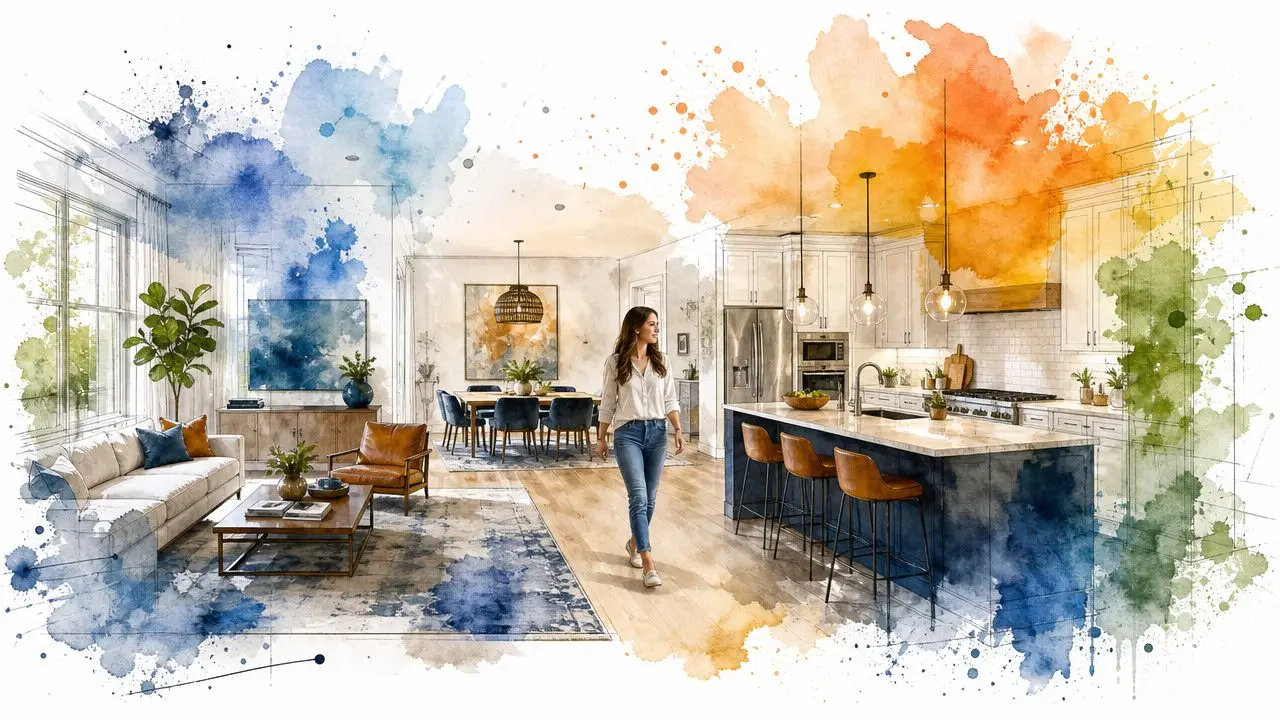
Open rooms need clear zones, but they rarely need hard dividers. Furniture does that work well when each piece helps define use and protect circulation at the same time.
A floated sofa can mark the living area without closing it off. A properly sized rug keeps the seating group from drifting into the kitchen side. Chairs should face the conversation area first, then allow easy turning toward the rest of the room. Space behind seating matters just as much as space in front of it, because that rear path often becomes the route between kitchen, dining, and adjoining rooms.
These moves work best when the zones are intentionally uneven. That is often the right answer in Bay Area homes, especially in older properties with angled walls, offset openings, or additions that changed the original footprint. One side of the room may need more clearance for prep and passing through. The other may need a tighter, more intimate furniture grouping.
A few zoning choices solve recurring layout problems:
- Float the sofa to define the edge of the living zone.
- Use a rug large enough to hold the main seating pieces together.
- Keep chairs inside the conversation grouping, not half in the walkway.
- Leave a clear route behind seating so traffic does not cut through the center of the room.
- Let one zone take more space than the other if that suits how the household lives.
Homeowners who want visual examples can explore open concept home designs and study how successful rooms guide movement without relying on walls.
The room should show people where to walk through placement, spacing, and proportion.
Solve awkward angles by reframing them
Awkward angles are common, and they do more damage than a modest room size. Standard furniture often looks out of place when every piece is forced to follow a diagonal wall or a crooked corner. The room feels unsettled because the layout is responding to the wrong line.
The better approach is to establish a strong center. In practice, that may mean centering the seating group on the rug instead of the wall, leaving one side more open for circulation, or using slimmer pieces where a passage narrows. I have seen asymmetrical plans outperform perfectly balanced ones again and again, because real households need routes, turning space, and flexibility more than mirrored furniture.
Consider these common situations:
| Challenge | What usually fails | What tends to work |
|---|---|---|
| Diagonal wall near seating | Lining up every piece with the wall | Centering the conversation area on the rug |
| Offset opening to kitchen | Matching furniture on both sides | Giving one side more visual weight and keeping the other open |
| Narrow pass-through | Deep seating crowding the path | Slimmer chairs or a shorter sofa with clear clearance behind |
| Uneven room shape | One oversized anchor piece | Smaller grouped pieces with adjustable spacing |
Custom sizing also has a place here. A slightly shorter sofa, a narrower console, or a table built to the right depth can solve a problem that standard dimensions keep creating.
Tape the room before buying
One of the most useful planning habits is also one of the simplest. Mark the footprint of the sofa, chairs, table, and walkways on the floor with painter's tape before anything is ordered.
That quick test answers the questions that matter. Does the coffee table leave enough legroom once all the seating is in place? Does the sofa back block the natural route to the kitchen? Does the angled wall make a chair feel fine on paper but cramped in the actual room?
For more specific layout examples, this guide to arranging furniture in an open-concept living space shows how to build zones that feel comfortable, usable, and visually settled.
A Unified Aesthetic Coordinating Materials and Finishes
A combined room feels settled when the kitchen and living area share a visual language. In Bay Area homes, that matters even more because open plans often come with odd geometry, partial walls, and sightlines that expose both spaces at once. If the finishes pull in different directions, the awkward angles feel sharper. If the palette is disciplined, the whole room reads as one considered composition.
Warm palettes connect open rooms better
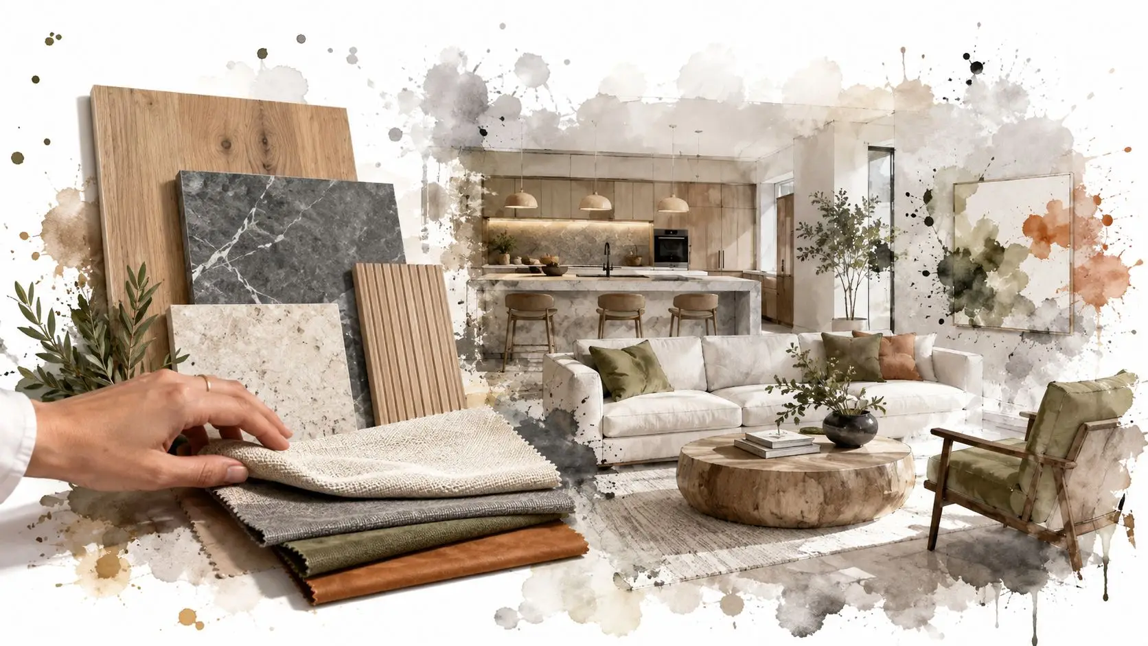
Current design forecasts and years of project experience point in the same direction. Layered neutrals, natural wood, muted greens, deep blues, and earthy tones tend to hold a kitchen and living room together better than stark white set against unrelated accent colors. The reason is simple. Warmth softens transitions, while hard contrast can make each zone feel isolated.
That does not mean every surface should match. It means each material needs a clear role, and those roles should support the room's architecture.
- Wood tones bring continuity and help awkward corners feel intentional.
- Stone surfaces add permanence and visual grounding.
- Upholstery balances cabinets, counters, and other hard finishes.
- Metal accents add definition, but they work best when limited to one or two finishes.
Homeowners refining a softer palette often benefit from outside examples, and Newline Painting neutral design tips offer a helpful look at how neutrals can stay warm instead of washed out.
Repeat materials across both zones
The rooms that age well usually repeat a few finishes with discipline. A cabinet wood tone can reappear in a cocktail table, shelving, or frame detail. A warm stone on the kitchen counter can be echoed with a smaller stone surface in the living area. That kind of repetition matters in asymmetrical layouts because it gives the eye something consistent to follow, even when the architecture is uneven.
A coordinated scheme might look like this:
| Element | In the kitchen area | In the living area |
|---|---|---|
| Wood | Cabinetry or panel detail | Media console, bookcase, or cocktail table |
| Stone | Counter surface | Hearth, accent table, or decorative surface |
| Color | Painted millwork or wall color | Upholstery, rug detail, or accent chair |
| Texture | Ribbed glass or fluted wood | Textured fabric, woven rug, or paneled case piece |
A unified room repeats the right materials often enough that the eye can rest.
Flooring deserves special attention because it is the one finish that runs through both zones. In open plans, it often does more to connect the room than wall color does. For homeowners weighing species, tone, and durability, this guide on choosing hardwood flooring helps frame the decision.
Keep contrast under control
Many open rooms go off course when every surface asks for attention. A dramatic backsplash, a busy rug, three metal finishes, bold veining, and unrelated wood tones can make the space feel unsettled, especially where the layout already has an angled wall or offset opening to contend with.
A stronger approach is to choose one dominant statement and let the supporting finishes stay quieter. In practice, that often means using color on larger surfaces, texture in fabrics and wood grain, and restraint with pattern. Custom millwork can help here too. A built-in painted to match the kitchen trim, or a media piece finished in a cabinet wood tone, can tie together two uneven zones without forcing symmetry.
The Heart of the Home Furniture and Seating Strategies
A combined kitchen and living room often succeeds or fails at the sofa line.
In Bay Area homes, I often see the same problem. The kitchen is straightforward, but the living side has an angled wall, an offset opening, or a path that cuts through the middle of the room. Furniture has to do more than look good. It has to define use, protect circulation, and make an irregular room feel intentional without forcing everything into symmetry.
Where standard furniture often falls short
A standard furniture plan usually assumes straight walls and centered layouts. Real homes rarely cooperate.
A broad opening from kitchen to living room may suggest a centered sofa, yet that choice can leave a pinch point behind it or force every other piece into awkward alignment. In rooms with angled walls, a long rectangular cocktail table often takes up the exact space people need to pass through. Matching chairs can make the plan feel stiff when the architecture is already uneven.
The better answer is usually an asymmetric seating group with clear purpose in each piece. One larger anchor, one lighter companion chair, and one table that softens the path often works better than a full matched set.
A few guidelines help:
- Sectionals work well when they define the living zone but still leave an open side for movement.
- Sofas with slimmer arms or lower backs hold the room without making it feel crowded.
- Round, oval, or freeform tables reduce sharp corners along busy walking paths.
- Smaller movable stools or chairs give flexibility for guests without locking the plan in place.
For room-specific examples, this guide on how to layout living room furniture shows how dimensions and traffic patterns point to different furniture choices.
Custom sizing improves function
Good furniture planning often comes down to inches.
Giorgi Bros. offers custom order options in wood species such as oak, cherry, and maple, along with a wide range of finishes, leathers, and fabrics. That range matters in rooms that need more than a standard showroom size. A slightly shallower sofa, a revised sectional return, or a different arm shape can open a walkway, square up an awkward corner, and make the seating area feel settled.
The trade-offs are practical, not theoretical:
| Situation | Standard piece | Custom solution |
|---|---|---|
| Narrow path behind sofa | Sofa depth crowds circulation | Reduced depth keeps the path usable |
| Angled wall throws off alignment | Fixed configuration wastes corner space | Revised sectional shape fits the room's geometry |
| Kitchen and living finishes don't relate | Generic fabric feels disconnected | Upholstery color ties into surrounding palette |
| Long-term wear concerns | Fashion fabric dates quickly | Durable leather or custom-fit textile supports daily use |
The best custom pieces do not call attention to themselves. They make the room work.
Buy for the room you live in, not the floor plan you wish you had.
Why investment pieces earn their place
Well-made furniture costs more at the start, but layout problems get expensive too. A sofa that is too deep, a chair that blocks a path, or a table that fights the geometry of the room usually gets replaced long before it wears out.
Pieces built with better frames, better cushions, and honest materials tend to stay useful longer. They also adapt more gracefully when a family grows, a room changes function, or a homeowner moves to a different house. That matters in open-plan spaces, where one piece often has to serve several roles at once.
Custom furniture is often the practical answer for homes with awkward angles, uneven sightlines, or a strong preference for natural materials. Amish furniture can make sense here as well for homeowners who value craftsmanship, solid wood construction, and a piece made to last rather than fill space for a few years.
Illuminating Your Design Lighting and Expert Guidance
By the time a combined living room and kitchen is furnished, the usual complaint is easy to spot. The sofa sits in the right place, the finishes relate, but the room still feels unsettled at night. One pool of overhead light flattens the seating area, leaves the kitchen work surfaces dim, and makes every awkward angle stand out more than it should.
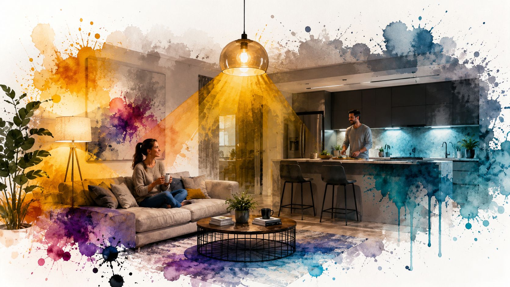
Lighting has to do more than brighten the room. It has to clarify how the space works.
Layer light by purpose
In open-plan homes, one fixture rarely solves the whole room. Good lighting usually comes from three working layers: ambient light for general visibility, task light where people read, prep, or gather, and accent light that gives the room depth.
That mix matters even more in Bay Area homes with offset walls, partial remodels, or living rooms that open to kitchens at odd angles. A ceiling fixture can cover the center of the room and still leave the actual seating zone feeling disconnected. A floor lamp placed at the outer edge of an asymmetric furniture grouping often does more to define that area than a brighter overhead fixture.
A useful checklist:
- Ambient light: Keep walkways and major surfaces evenly lit after dark.
- Task light: Place focused light at reading chairs, side tables, islands, and counters.
- Accent light: Highlight shelving, artwork, texture, or a fireplace wall so the room has shape in the evening.
Let lighting reinforce the zones
Fixtures should follow the plan of the room, not fight it. In a combined space, that often means the living area and kitchen share a visual language without repeating the exact same fixture style.
A pendant over the island can anchor the kitchen zone. A pair of sconces or a floor lamp can hold the living area in place. If the room is slightly off-square, lighting can help correct the feeling without forcing symmetry. I often recommend using matching finishes with different forms, for example a metal detail repeated across pendants, lamps, and sconces, so the room feels connected while each zone keeps its own purpose.
This is especially helpful in rooms where the furniture layout is intentionally asymmetric. Light can mark edges, soften dead corners, and keep circulation paths clear.
Good lighting shows people where to settle, where to move, and where to work.
Why guidance matters with custom projects
Lighting choices are tied to furniture scale, sightlines, and how a family uses the room at different times of day. Once custom upholstery, special-order case goods, or difficult room geometry are involved, small mistakes become expensive. A chandelier hung too low, a lamp with the wrong spread, or a sconce placed without regard to a sectional arm can throw off the whole composition.
Experienced guidance helps prevent those misses. The work is practical. Confirm dimensions, test proportions, coordinate finishes, and make sure each layer of light supports the way the room is arranged. For homeowners who want help with those decisions, interior design consultation services can bring layout, lighting, and custom furniture choices into one clear plan.
That kind of planning also helps with adjacent decisions, including guest seating, home office spillover, or phased purchases when the room has to come together over time. In long-lived spaces, careful lighting is never a finishing touch. It is part of the structure of the room.
Bringing It All Together Your Lifetime Investment
A family lives in an open room for years, not for the first week after installation. That is why the best combined living room and kitchen plans are judged by daily use. Chairs need to pull out without blocking a walkway. A sectional needs to hold its shape while defining the living zone. An awkward corner near the kitchen needs a piece that fits it properly instead of leaving dead space.
In real Bay Area homes, the strongest rooms are rarely perfectly balanced or fully symmetrical. They work because each zone has a clear job, circulation stays open, and the furniture is scaled to the architecture. That often means choosing one excellent piece over two smaller compromises, or ordering a custom solution when an off-the-floor option leaves gaps, crowds an angle, or interrupts the way people move through the room.
Quality earns its keep over time.
Better construction holds comfort, wears in with dignity, and keeps looking appropriate after paint colors, hardware finishes, and short-lived trends change. The long-term math is straightforward. Fewer replacements, fewer repairs, and fewer purchases made to correct an earlier mistake.
That same standard applies to how pieces are selected. Homeowners planning Furniture South San Francisco, Bay Area Interior Design, and Custom Furniture projects usually do better with measured guidance and time to compare options carefully. In open-plan rooms, small differences in seat depth, arm height, table proportion, or wood tone can change how the whole space functions.
Seeing furniture in person helps. It is easier to judge scale, comfort, finish, and craftsmanship when the pieces are in front of you, especially for a room that has to connect cooking, dining, conversation, and everyday traffic without feeling crowded or overmatched.
Visit Giorgi Bros. Furniture in South San Francisco to compare materials up close, test investment pieces in person, and get thoughtful guidance on layouts built for real household use. If your room has awkward angles, uneven walls, or competing functions, a clear plan and the right furnishings can turn it into a space that works well now and still makes sense years from now.